So you’ve got your new LED video wall and now you’re ready to start creating content — great!
But hold right there — you can’t just go throw up some pic art and a bunch of text on a red background and call it a day.
There are many factors to consider when creating your LED display content, and today we’re going to provide 5 tips to ensure your content is ready for prime time.
Clear, concise messaging
You’ve invested in a new LED video wall, so you’ve got to put it to good use. First, you must think about how you’ll be using the display — is it for promotions? Sales? New products? Messaging?
Comparison
Curious about what makes Firefly LED different?
Depending on what the purpose is, you’ll want to work on the actual text you are using. Best practices are to keep your copy short and sweet, as you want your viewers to understand what you’re trying to say quickly and easily, with no trouble.
Definitely avoid long paragraphs, and stick to either a single headline, in larger text, or one headline and one short call to action below. For example:
- Headline: 50% Mens Jeans Today Only!
- Call To Action: Select styles, see store for details
This example is very concise and helps viewers understand exactly what you’re promoting, without confusion.
Use design principles
As with any digital display, for maximum effectiveness you’ll want to follow standard design principles.
So, what does that mean? Well, we could really go deep into it, but we understand not everyone is a trained graphic designer, so here’s the 3 most important you should aim to follow:
- Colors: Use proper contrast in your color palette, and try to stick to only 2-4 colors at most. This will help for optimal viewing and readability of your digital signage. Your headlines should utilize a color with the most readability and best contrast.
- Fonts: What fonts you use play a large part in how your LED video wall will be seen. First and foremost, you should always stick to your brand fonts wherever possible. This will help with brand recognition and cohesion. Use no more than 2 fonts — one for your headline, and one for your subhead or call to actions (you can use just one, and alter the weights — i.e. Bold or Heavy for the headline, and Regular or Light for subheads.)
- Layout: The third design principle we recommend following is a good layout. Don’t cram everything in one corner, or make your most important information too small. Use symmetry, and space elements evenly with proper hierarchy so that your messaging is seen.
Know your screen specs
Optimizing your content relative to your specific LED video wall specs will help your picture look great, and avoid added pixelation or distortion issues. Here are the three specs that are most important for your content:
- Ratio: Knowing your display’s ratio is crucial to your video content displaying properly. Most video content is displayed in a 16:9 ratio, however if you have a custom screen yours might be different.
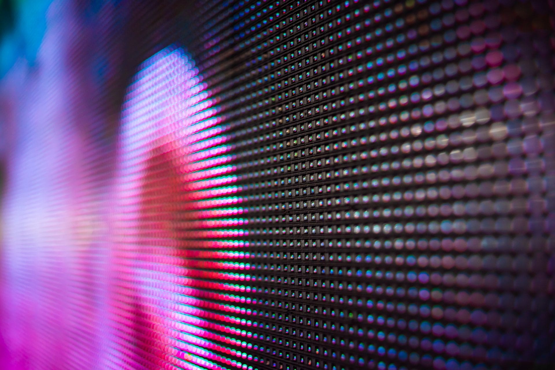
- Pixel Pitch: Depending on the viewing distance of your display, and the pixel pitch, will be a large factor in how you optimize your content. If viewing distance is much farther, you’ll want larger/oversized text and imagery due to lower resolution; but closer up, you can have smaller content as it’ll be viewed at a higher resolution.
- Resolution: Much like pixel pitch, the larger your screen is then the lower the resolution you can get by with. More than likely, if you are testing some content and it is pixelated or blurry, you’ll need to increase the resolution.
Use transitions
When it comes to utilizing motion graphics, animations, and video content on your LED video wall, to create more pleasing experiences you’ll want to incorporate nice transitions in-between messaging. For example, a nice dissolve fade will help and make it easier on the eyes instead of abrupt, sudden changes on your display.
In addition to the easing transitions, be sure to actually time the different content to ensure there’s enough time to read it. Too fast, and you’ll lose the opportunity to get your message across, but too slow and you’ll lose another opportunity to show more.
Test before use
This should go without saying, but test, test, test! We always recommend doing several rounds of testing with your content before making it live on your LED video wall. During off hours or least exposure, you can perform these tests on your LED signage and be sure to view it at the actual viewing distance of your audience. By utilizing your sending controller, tweak the picture and settings as needed for maximum effectiveness.
Conclusion
As you can see, there are many factors that go into optimizing your content for a great-looking LED video wall.
By creating concise messaging, following design principles, knowing your screen specs, utilize transitions, and fully testing, you’ll be on the way to creating high quality content.


